
Lauren Klein: “There’s no such thing as raw data”
Posted on Jun 22, 2020 by FEED Staff
Lauren Klein is an associate professor in the departments of English and Quantitative Theory & Methods at Emory University. We talk to her about the deceptive nature of data, how numbers aren’t neutral and about her new book Data Feminism, co-written with MIT’s Catherine D’Ignazio
FEED: Can you tell us about your background? And ‘digital humanities’?
Lauren Klein: It’s one of those things where if you look backwards, it seems like it makes sense, but it definitely didn’t feel like it was making sense on the way. I’ve always been interested in computers and programming, but also reading and books. For most of my life, I thought I had to pick between them. I thought it was a binary choice. So I spent most of my 20s and some of my 30s toggling between them and then, right as I was finishing grad school for English – and I nearly dropped out and went back to software development – it sort of dovetailed with the emergence of this new field in academia, called digital humanities.
Digital humanities is about how you can take computational methods and use computers to answer humanities-type questions, historical questions, cultural questions, or to use humanistic approaches to ask questions about technology. And I was like, ‘Oh my God, this is what I’ve been wanting to do my whole life!’ So I left New York for a job at Georgia Tech, in Atlanta.I was there for eight years. Then this past year, Emory University, also in Atlanta, was looking to start a data science department. They’re trying to make it a programme that brings together statistical methods and data analysis techniques, high-performance computing with traditional liberal arts disciplines – not just English, but the social sciences. So I’ve just finished our first year there – online.
Engineers who can’t write work for engineers who can
I think it’s increasingly clear to more people that we need these humanistic approaches to address all the technical stuff we’ve got out there. The problems we’re causing are so enormous that we need all the methods at our disposal to help figure out how to solve them.
FEED: We do constantly hear that we need to get more people into STEM (science, technology, engineering & maths). But sometimes that feels a little short-sighted.
Lauren Klein: The really interesting thing is that at Georgia Tech, a big engineering school, as is MIT, where my collaborator Catherine D’Ignazio works, have huge amounts of humanities requirements for the engineers. There’s a joke at MIT, which was passed on to Georgia Tech, that engineers who can’t write, work for engineers who can.

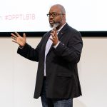
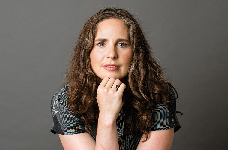
A perfect partnership Catherine D’Ignazio is director of the Data + Feminism Lab, MIT, and co-authored the Data Feminism book
FEED: You collaborated with MIT’s Catherine D’Ignazio on the book, Data Feminism. How did this come about?
Lauren Klein: We actually didn’t know each other before we started working together. I think that’s different from how most collaborations work. But for me and Catherine, it was a case of us both being interested in this very specific thing.
One of my research interests is the history of data visualisation and the people who have been left out of the standard, Edward Tufte-style account of how you ought to design clean, clear, minimalist data visualisations. It turns out there’s a whole bunch of people who don’t fit into that lineage and have been doing really interesting stuff for hundreds of years.
I’m working on a project now that looks back to some of these 18th and 19th century early visualisation innovators. A lot of them, it turns out, were women, coming from places like primary schools, teaching young children. As they were early childhood educators, they weren’t viewed with the same level of prestige as someone like William Playfair who was a Scottish political economist who invented the pie chart. People think a serious intellectual inquiry looks like political philosophy or political economy. They don’t think it looks like teaching kindergarten.
Edward Tufte is an American statistician, working at Yale. His big thing is that visualisation should be clear and incisive; you should look at it and, in an instant, be able to tell what the data say. But a lot of these early women were using visualisation in different ways, as tools to think with.
One of the people I’ve written about – and I’ve tried to reuse or reanimate some of her techniques – had this big chart that she laid out like a rug and invited the kids to sit around it and sort of contemplate things like colour for example. She really viewed visualisation as this process where the kids would be coming to their own learning in their own way, rather than her doing it from top down. That’s a very feminist theoretical move to say that knowledge isn’t like this top down system where you just need to believe what I say is true, but that it is this process and interplay between the person who knows something and the person who is coming to know.
FEED: And how did the book Data Feminism come about?
Lauren Klein: I had come to Boston to give a talk on a historical project that I was working on called Feminist Data Visualisation. It turned out that Catherine and I had a couple of mutual friends who saw that we were working on the same things. We originally wrote a short article together for the visualisation community, for the IEEE VIS conference on the idea of feminist data visualisation. We asked what would its principles be. How could you put it into action?
Then Catherine was approached by an editor of a new series at MIT Press who said: “I actually think this could be a book”. When someone asks if you want to write a book for MIT Press, you don’t say no. And so we were off and running.
Unfortunately, though not surprisingly, the stuff that we write about in the book is very topical for everything we’re experiencing right now.
FEED: So a very basic question, or maybe not so basic: what is data?
Lauren Klein: Data is one of those words that you think should have an easy definition, but how people choose to define data, as we explain in the book, is actually quite contextual and political.
We say in the book that data is pretty much anything that has been systematically collected. So data can be qualitative or quantitative. It can be numbers, it can be words, it can be big, it can be small. And this is sort of pushing back at the idea of data as only Big Data, or as numbers that are seemingly objective.
We talk about what it means to be truly objective, and why what people think is objective is not necessarily actual, objective information. There’s this historical gender divide between the types of things that are valued – these are numbers, bigness, objectivity, distance from the subject at hand, things that historically and culturally tend to be coded male, and the things that historically have been associated with women. These are things that appeal more to emotion rather than reason, things that are maybe smaller, more nuanced, maybe qualitative data rather than quantitative data. Those things have sort of been devalued.
We trace this back to binary thinking, which feminist theory for many years has helped to challenge and we show how things are never an either/or. It’s always a both/and. And usually when there’s some sort of binary, it’s hiding some sort of hidden hierarchy and there’s a reason why certain people want it like that.
Data is truly a double-edged sword
FEED: Do you find that data is then often just a tool for maximising power?
Lauren Klein: William Playfair is an interesting case in this. He was around during most of the 18th century, and the reason why he saw the need for data visualisation was the American Revolution, which began in Massachusetts. Things were so chaotic and he thought, “I don’t know what’s going to happen in the future and I want to be able to control the narrative. I want to be able to create this picture of what is happening right now”. He was particularly interested in import and export data between England and elsewhere in the world. This desire to control the narrative came out of political instability. He wanted to preserve what he called “a picture of the past”.
FEED: What are the challenges we’re facing today around how data is used?
Lauren Klein: One is in the hype around Big Data. We tend to prioritise large data sets instead of small data sets. We believe bigger data sets will tell us more and will provide more accurate information than smaller data sets. But that is not always true. Again, it’s not binary – you can have big and small. Both tell you something, but neither tells you everything.
The second thing is we tend to think that collecting more data will solve the problem. Here’s a problem, let’s collect some data on it and then we’ll get closer to a solution. But in some cases, that is actually not the best thing to do. In the book, we call this the paradox of exposure.
Immigration is a good example of this. DACA (Deferred Action for Childhood Arrivals) is a US programme that was started under the Obama administration. They said: “Kids of undocumented immigrants deserve all the protections that the US can offer. Come register yourself. You can get a driver’s licence, qualify for student loans – we’ll protect you.”
Literally the exact same information, in other hands, can do tremendous
harm. Now ICE, the US Immigration and Customs Enforcement, can show up at your door, using that nice, comprehensive list of undocumented immigrants to go after them.
Data is truly a double-edged sword. And given that power, on the one hand for making arguments for effecting change, for calling attention to large-scale problems, and then on the other hand, for tremendous harm in terms of identification of outliers in terms of persecution. How can we make sure that people understand the power they hold in their hands?
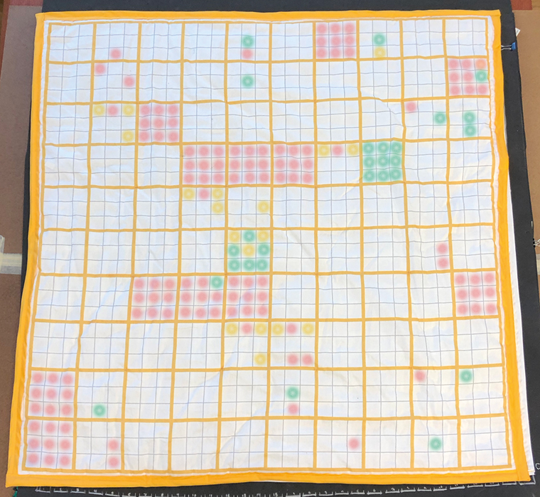
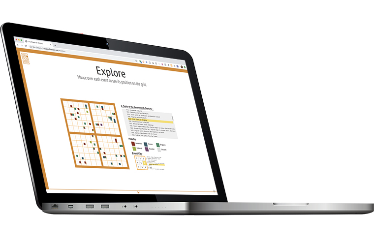
Shape of things to come Elizabeth Palmer Peabody was a 19th-century American educator and founder of the first US kindergarten. One of her innovations was to create non-linear visualisations – mural charts – of history using shape and colour. Pictured right is an LED-enabled fabric reconstruction. Learn more at shapeofhistory.net
FEED: Are data and facts the same thing? Is it possible to have data, but no facts?
Lauren Klein: Data is always produced by people. Even sensor data is registered by a sensor that was created and parameterised by a person or team. Data doesn’t come from nowhere. There’s no such thing as raw data.
So you’re never dealing with facts. You’re dealing with human-produced information. And yet, this doesn’t make it not valuable. It doesn’t mean that we’re descending into relativism, where you can’t trust anything or learn anything from anything.
There’s a famous feminist philosopher, called Donna Haraway, who talks about the “god trick”. This is the belief that when looking at data, you’re seeing everything from up in the heavens, in an omniscient godlike view. This is particularly true when you look at a map of the world or a large-scale network. You say to yourself: “It’s showing me everything”. But it’s a trick.
There are two parts: one is the godlike perspective. The other is the trick part. Because, as anyone who’s produced one of these data visualisations knows, you made some choices. It’s always produced by another person.
Again, that doesn’t delegitimise the knowledge. It just makes you ask what the contexts are under which this visualisation or data set or analysis is being performed. And the ultimate goal is, again, not that we can’t trust it, but that we know more about what it is telling us precisely, like asking what’s included in the data. What were the missing data in your data set? Can our model be productively applied? And in what contexts?
You might say it definitely applies in these contexts, but doesn’t apply in those contexts. And that makes better science.
When you type ‘black girls’ into google, you get porn sites
FEED: What are your thoughts about how data is used in media, particularly with content recommendations?
Lauren Klein: Obviously, machine learning and predictive and generative models are used all over the media industry. Your YouTube playlists, Spotify playlist, Google search results, they’re all these predictive algorithms, and it’s really important to understand the maths behind them. The off-the-shelf ones, and the ones that most people adapt for their use, are set up so that they amplify existing content or existing preferences. And this optimises the model, but it doesn’t optimise society. There’s a ton of examples. A simple one is Spotify recommendations. They had to work really hard to not make the recommendations become narrower and narrower the more you listened, because that’s the model. They’re set up to converge on a clearer answer.
Now it’s one thing if it’s music preferences, but I had a student who looked at YouTube recommendations and discovered there’s real racial bias in who it suggests you watch next. And you can zoom back a little bit more and look at someone like Safiya Noble. She’s written a book called Algorithms of Oppression, which is about Google and these recommendation engines. They are ultimately driven by people’s preferences and because people are racist and sexist, and because there are imbalances of types of people using these engines, they perpetuate oppression.
One example that she leads with in the book is the difference in Google search results between when you search for ‘black girls’ and ‘white girls’. When you type ‘black girls’ into Google, you get porn sites. And when you type ‘white girls’, you get wholesome stock photography. White male users of Google, when they type ‘black girls’ into the search box, they tend to not be looking for wholesome photography of black kids; they’re looking for porn. And once they click on that link, it moves higher and higher up because Google is optimising for those users. Then the algorithm starts to learn, in the computational sense, that they should upvote the porn sites.
So then this little black girl types that search query into Google, and what does she see? She doesn’t see what she wants, she sees what the majority of white male users want. This is just an example of a feedback loop – and feedback in the engineering sense, not just that it goes around and around, but that it actually
gets amplified.
FEED: What are some of the solutions?
Lauren Klein: The point we make in our book is asking whether you are truly designing for everyone. Or can you hack an existing system in order to make it show more choices to more people? And there are some people, who we quote in the book, who think you should actively optimise for the margins; that you should be designing for the people on the extremes, because those people tell you more about the widest range of human experience than someone in the centre.
In the book, we have laid out seven principles of data feminism (see page 41) that have to do with different approaches, and we hope to offer seven different entry points into thinking about how you can do better. Not all of them apply in all contexts, but they’re all intended, not just as provocations but as practical advice. We want people to think: ‘So I work in industry or for one of the Big Five or want to start a non-profit tech company – whatever the entry point may be – how do I do something good instead of something harmful with the technical abilities I have?’
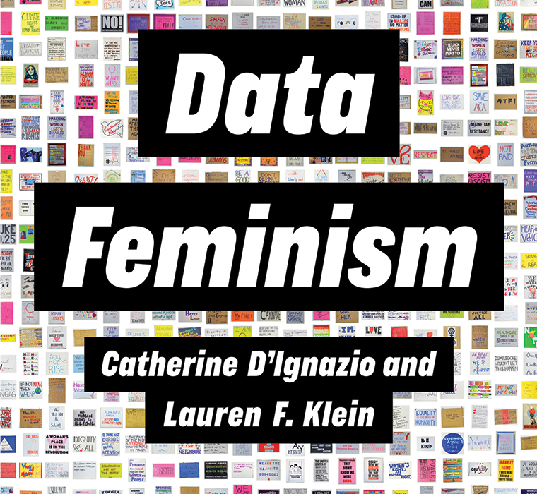
Devil’s in the data The book, Data Feminism explores the intersection of feminist thinking and data science
Seven Core Principles of Data Feminism
- Examine power: Data feminism begins by analysing how power operates in the world.
- Challenge power: Data feminism commits to challenging unequal power structures and working toward justice.
- Elevate emotion & embodiment: Data feminism teaches us to value multiple forms of knowledge, including the knowledge that comes from people as living, feeling bodies in the world.
- Rethink binaries & hierarchies: Data feminism requires us to challenge the gender binary, along with other systems of counting and classification that
perpetuate oppression. - Embrace pluralism: Data feminism insists that the most complete knowledge comes from synthesising multiple perspectives, with priority given to local, indigenous and experiential ways of knowing.
- Consider context: Data feminism asserts that data are not neutral or objective. They are the products of unequal social relations and this context is essential for conducting accurate, ethical analysis.
- Make labour visible: The work of data science is the work of many hands. Data feminism makes this labour visible so that it can be recognised and valued.
This article first appeared in the June 2020 issue of FEED magazine.